Tổng hợp Bài Mẫu Giải đề IELTS Writing Task 1 2025 | Phân tích chi tiết & Bài mẫu | Sample Cập nhật liên tục

Tiêu chí chấm điểm IELTS Writing Task 1 và Giải đề IELTS Writing Task 1
IELTS Writing Task 1 được chấm dựa trên 4 tiêu chí, mỗi tiêu chí chiếm 25% tổng điểm. Trước khi luyện viết hay học bài mẫu, người học cần hiểu rõ giám khảo thực sự đang chấm gì, từ đó tránh mất điểm oan vì những lỗi không đáng có.
Thứ nhất là Task Achievement, đánh giá việc bạn có mô tả đúng và đủ thông tin từ biểu đồ, bản đồ hoặc quy trình hay không. Một bài đạt điểm cao phải có overview rõ ràng, nêu được xu hướng hoặc đặc điểm nổi bật, đồng thời chọn lọc thông tin quan trọng thay vì liệt kê dàn trải. Thứ hai là Coherence and Cohesion, tập trung vào bố cục bài viết và khả năng liên kết ý. Bài viết cần được chia đoạn hợp lý, trình bày logic và sử dụng từ nối vừa đủ để người đọc dễ theo dõi.
Tiêu chí thứ ba là Lexical Resource, đánh giá vốn từ vựng và cách dùng từ. Trong Task 1, giám khảo ưu tiên từ vựng mô tả số liệu, xu hướng, thay đổi được dùng chính xác và tự nhiên hơn là từ khó. Cuối cùng là Grammatical Range and Accuracy, xem xét mức độ đa dạng và độ chính xác của ngữ pháp, bao gồm thì, cấu trúc câu và sự nhất quán về số ít – số nhiều. Hiểu rõ bốn tiêu chí này sẽ giúp bạn viết đúng trọng tâm và tăng band điểm Writing Task 1 một cách bền vững.
Tổng hợp các bài Giải đề IELTS Speaking và Writing được biên soạn bởi đội ngũ chuyên môn giáo viên IELTS 8.0 nhà Cú https://owlenglish.vn/category/kien-thuc/giai-de/
Bài mẫu Giải đề IELTS Writing Task 1 – Dạng bài: Mixed Charts
Đề bài: The bar chart gives information about the life expectancy in Japan, Korea, the United States, and Indonesia, and the table shows the change in life expectancy between 1953 and 2008.

The bar chart illustrates the life expectancy of people born in 2018 across four countries, while the table highlights the increase in life expectancy from 1953 to 2008 in the same nations.
Overall, Japan had the highest life expectancy in 2018, whereas Indonesia had the lowest. Despite this, Indonesia experienced the most significant improvement in life expectancy over the 55-year period.
In 2018, people in Japan could expect to live around 81 years, followed by Korea at approximately 79 years. The United States had a slightly lower figure at around 77 years, while Indonesia lagged behind at about 67 years.
From 1953 to 2008, Indonesia saw the greatest rise in life expectancy, increasing by 15.7 years. Korea also experienced a notable improvement of 12.5 years. In contrast, Japan and the United States showed relatively small increases of just 3.5 and 3 years, respectively.
Bài mẫu Giải đề IELTS Writing Task 1 – Dạng bài: Maps
Đề bài: The plans below show a school library five years ago and the same library now. Summarize the information by selecting and reporting the main features, and make comparisons where relevant.

The diagrams illustrate the changes made to the layout of a library over a five-year period.
Overall, the library has been modernised with a clear shift from traditional reading spaces to technology-based and private study areas. Several original facilities have been repurposed or upgraded in order to better accommodate students’ individual study needs.
Five years ago, the central area was occupied by large shared study tables, while bookshelves were placed along both the top and bottom sides of the library. On the left-hand side, there was a classroom next to a meeting room and a combined borrowing-and-returning desk. Meanwhile, the right-hand side featured a computer desk area for desktop use and a library office.
At present, the open shared study space in the middle has been replaced by individual study tables, allowing for more privacy and focused learning. The previous classroom on the left has been converted into a recording studio, and the original single borrowing desk has been separated into two dedicated sections for borrowing and returning books. In addition, the library office on the right has been transformed into a conference room. New laptop desks have also been installed along the right-hand side and the bottom of the layout, creating extra technology-based study spaces for students.
Bài mẫu giải đề IELTS Writing Task 1 – Dạng bài: Bar Chart
Đề bài: The average prices per kilometre of clothing imported into the European Union from six different countries in 1993 and 2003 are shown in the bar chart below. Summarize the information by selecting and reporting the main features, and make comparisons where relevant.

The bar chart compares the average price per kilometre of clothing imported from six countries in 1993 and 2003.
Overall, while prices generally fell in the more developed exporters, they rose noticeably in several Asian countries. Argentina and Brazil remained the most expensive sources in both years, whereas Bangladesh remained the cheapest.
In 1993, Argentina had the highest cost at around £28 per kilometre, though this fell slightly to about £26 in 2003. Brazil followed at roughly £23 in both years, showing almost no change. Japan experienced a moderate decline from £15 to £13, continuing the downward trend seen among the more established exporters.
By contrast, the three developing Asian nations saw increases. China rose sharply from £10 to nearly £17, overtaking Japan by 2003. India’s figure climbed from… to…, while Bangladesh, though still the cheapest supplier, doubled its price from approximately £3 to £6. Despite these rises, their prices remained considerably lower than those of South American countries.
Bài mẫu giải đề IELTS Writing Task 1 – Dạng bài: Bar Charts
Đề bài: The bar charts give information about the salaries and university fees of students from three universities in two spheres – Law and Business. Summarise the information by selecting and reporting the main features and make comparisons where relevant.

The bar charts compare the average salaries of Law and Business graduates from three universities (A, B, and C) and the tuition fees they are required to pay.
Overall, students from University B tend to receive the highest salaries in both fields, while tuition fees are consistently higher than salaries across all universities and disciplines.
In Law, graduates from University B earn the most, at around $40,000, yet pay tuition fees of approximately $60,000. Similarly, University C’s Law students earn just under $40,000 but pay nearly $55,000 in fees. Interestingly, University A offers the most balanced outcome in this field, with both salary and tuition around $40,000.
A similar pattern appears in Business, where salaries are lower than tuition at every university. University B again offers the highest salary at $40,000, though fees reach nearly $50,000. University C’s Business graduates earn slightly less but pay the highest tuition (close to $60,000), while University A has the lowest figures for both.
Bài mẫu giải đề IELTS Writing Task 1 – Dạng bài:Line Graph
Đề bài: The first graph shows the number of train passengers from 2000 to 2009; the second compares the percentage of trains running on time and target in the period. Summarise the information by selecting and reporting the main features, and make comparisons where relevant.
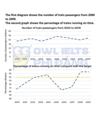
The first graph illustrates the number of train passengers between 2000 and 2009, while the second shows the percentage of trains running on time compared to the target.
Overall, the number of passengers fluctuated over the period, whereas punctuality initially improved, then declined, before rising again. Notably, trains only met or exceeded the target in 2004, 2008, and 2009.
From 2000 to 2002, passenger numbers grew slightly from about 38 to 43 billion before falling to a low of 39 billion in 2003. They peaked at approximately 48 billion in 2005, followed by a gradual decline and a minor rise in 2009.
In terms of punctuality, performance improved steadily to 95% in 2004, surpassing the 94% target. However, it dropped significantly to 90% by 2006. After that, it rebounded sharply, reaching 97% in both 2008 and 2009.
Bài mẫu giải đề IELTS Writing Task 1 – Dạng bài: Charts
Đề bài: The charts provide information about students in 2007 who were happy with different facilities at a university in the UK.

The charts illustrate the satisfaction levels of undergraduate and postgraduate students regarding school rooms, the university cafeteria, and school facilities at a UK university in 2007.
Overall, most students were satisfied with the school rooms, while the university cafeteria received the lowest satisfaction levels, particularly from undergraduates. Postgraduate students tended to show higher satisfaction in most areas, except for school facilities.
Regarding school rooms, both groups gave similar responses, with 62% of undergraduates and 63% of postgraduates being very satisfied. Only around a quarter of each group reported dissatisfaction. As for the cafeteria, 52% of undergraduates were very satisfied compared to a higher 73% of postgraduates. However, dissatisfaction was noticeably higher among undergraduates (26%) than postgraduates (11%).
The greatest contrast was observed in opinions on school facilities. While a striking 85% of undergraduates were very satisfied, only 43% of postgraduates shared that view. Additionally, 25% of postgraduates said they were not satisfied, significantly more than the mere 1% of undergraduates who felt the same.
Bài mẫu giải đề IELTS Writing Task 1 – Dạng bài: Process – Pineapples and Pineapple Products
Đề bài: The diagram below shows the process of growing and preparing pineapples and pineapple products. Summarise the information by selecting and reporting the main features, and make comparisons where relevant.

The diagram illustrates how pineapples are cultivated and then processed into three commercial products.
Overall, the process can be divided into two phases: cultivation and post-harvest processing. After being grown, the fruit is then categorized into three lines that produce juice, canned slices and fresh exports, respectively.
Initially, pineapples’ crowns are planted when the temperature is ideal, around 28–30°C. During the first seven months, the plants develop until chemicals are applied to stimulate further growth. After a five-month period, the fruit reaches desirable size, measuring around 30 centimetres in height and weighing roughly two kilograms. Once picked, each pineapple is rinsed thoroughly with water to remove dirt and surface impurities.
The next step involves sorting the fruits according to their size: small, medium and large. Following classifying, the process splits into three pathways. In the first, the small-sized pineapples are peeled after having their tops cut off. Afterwards, they are fed into an extractor, from which pineapple juice is produced. In the second line, the medium-sized fruits undergoes a similar cutting and peeling stage, before being sliced and packed in cans for distribution. Meanwhile, a third line produces fresh pineapples for export: the large-sized pineapples are coated with wax to preserve, packed in crates and finally exported to foreign markets by sea freight.
Bài mẫu Giải đề IELTS Writing Task 1 – Dạng bài: Mixed Chart
Đề bài: The charts give information about the percentage of men and women who had driving licences in one European country in various years.
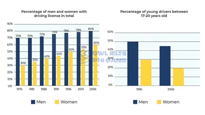
The charts illustrate the percentage of men and women holding driving licences in a European country across selected years, and the proportion of young drivers aged 17–20 in 1996 and 2006.
Overall, the proportion of both men and women with driving licences increased steadily over time, with women showing a more significant rise. Meanwhile, the percentage of young drivers in both genders declined slightly between 1996 and 2006.
In 1976, 70% of men and only 30% of women had driving licences. While the male figures rose moderately to 80% by 2006, the percentage of licensed women doubled, reaching 60% in the same year. The gender gap narrowed considerably over the 30-year period.
Regarding young drivers, in 1996, nearly 50% of men and 30% of women aged 17–20 held a licence. By 2006, both figures had dropped sharply, with men’s percentage falling to 45%, and women’s dropping more sharply to 20%.
Bài mẫu Giải đề IELTS Writing Task 1 – Dạng bài: Bar Chart
Đề bài: The bar chart shows the number of homes, each worth 5 million dollars or more, sold in eight countries.
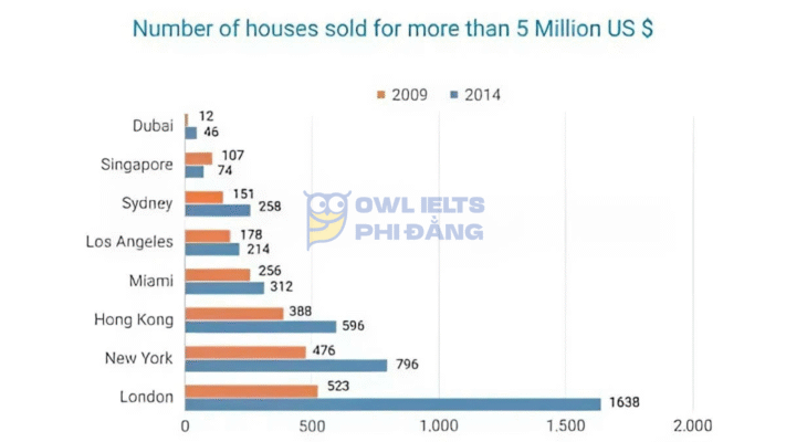
The bar chart illustrates the number of houses sold for over 5 million US dollars in eight major cities worldwide in 2009 and 2014.
Overall, the number of luxury property sales increased in almost all cities over the five-year period, with London showing a dramatic surge. In contrast, Singapore was the only city to experience a decline.
In 2009, London recorded the highest number of expensive home sales at 523, followed by New York with 476 and Hong Kong with 388. By 2014, London’s figure had skyrocketed to 1,638, more than tripling its 2009 level, maintaining a wide lead over other cities. Similarly, both New York and Hong Kong saw significant rises, reaching 796 and 596 sales respectively.
Elsewhere, the growth was more moderate. Sales in Sydney rose from 151 to 258, while Miami and Los Angeles increased slightly to 312 and 214 respectively. Dubai also showed a notable rise from only 12 to 46. However, Singapore’s number fell marginally from 107 to 74, marking the only downward trend in the property sales chart.
Bài mẫu Giải đề thi IELTS Writing Task 1 – Dạng bài: Line Graph
Đề bài: The graph below gives information about telephone subscribers per 1000 inhabitants, Africa 1995 – 2004
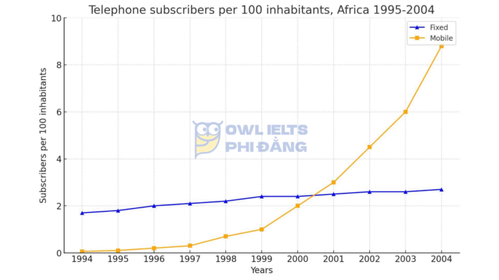
The line graph illustrates the number of telephone subscribers per 100 inhabitants in Africa from 1995 to 2004, comparing fixed-line and mobile services.
Overall, while the number of fixed-line users showed only a modest increase throughout the period, mobile phone subscriptions experienced dramatic growth, eventually surpassing their fixed counterparts by a wide margin.
In 1995, there were fewer than 2 fixed-line subscribers per 100 inhabitants, and this figure rose gradually to around 2.7 by 2004. Growth was relatively stagnant after 1999, indicating limited expansion of fixed services.
In contrast, mobile phones started from almost zero in 1995 but saw a sharp rise from 1999 onwards. By 2000, subscriptions had reached 2 per 100 inhabitants, overtaking fixed lines just a year later. The trend accelerated rapidly, climbing to nearly 9 subscribers per 100 inhabitants by 2004, more than triple the fixed-line figure. This suggests that mobile phones became the dominant form of telecommunication in Africa within a single decade.
Bài mẫu Giải đề IELTS Writing Task 1 – Dạng bài: Line Graph
Đề bài: The charts below show the levels of satisfaction of full-time and part-time students with IT support and with current opening hours. Summarise the information by selecting and reporting the main features, and make comparisons where relevant.

The charts illustrate the level of satisfaction among full-time and part-time students regarding IT support and opening hours.
Overall, full-time students appeared more content with IT services, whereas part-time learners expressed greater dissatisfaction. By contrast, both groups were largely positive about opening hours, with full-time students showing particularly high approval.
Regarding IT support, over half of full-time students (54%) reported being very happy, compared with only one-fifth of part-time learners. Additionally, 31% of full-time students were quite happy, while this figure was slightly higher among part-time students, at 35%. Notably, 45% of part-timers were not satisfied at all, triple the proportion of their full-time counterparts.
Turning to opening hours, almost nine in ten full-time students expressed strong satisfaction, whereas a slightly lower but still significant 72% of part-time students shared the same view. Only 12% and 5% of full-time and part-time learners respectively reported dissatisfaction, with minor proportions choosing the “quite happy” option.
Bài mẫu Giải đề IELTS Writing Task 1 – Dạng bài: Maps
Đề bài: The diagrams below show the development of a town called Brindell and the local areas in 1800, 1900 and 2000. Provide an overview of the information by identifying and describing the key details, and include comparisons where appropriate.
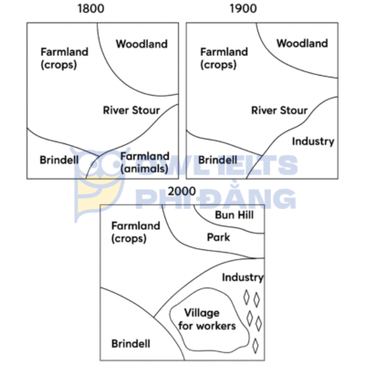
The three maps illustrate how the town of Brindell and its surrounding areas changed over a 200-year period, from 1800 to 2000.
Overall, the area witnessed a transformation from a predominantly agricultural and natural landscape into a more urbanised and industrialised region. While farmland and woodland areas were still present by 2000, the expansion of industry, infrastructure, and residential zones was a prominent development.
In 1800, Brindell was surrounded mainly by farmland used for crops and animals, along with a large woodland area to the north and the River Stour running through the region. No significant man-made structures other than Brindell itself were present.
By 1900, industrialisation had begun to emerge. A new industrial area was established to the east of the River Stour, replacing part of the farmland once used for animals. Additionally, a residential area called Bun Hill and a small “village for workers” appeared near the industrial zone, indicating a growing population associated with manufacturing activities.
By 2000, the town had experienced further development. The industry expanded slightly eastwards, and the village for workers became more defined. A park was introduced just north of the woodland, enhancing the recreational space available to residents. Bun Hill remained, but farmland for animals had been completely removed, with only crop-based farmland remaining in the west. Despite urbanisation, the River Stour and the woodland in the north stayed intact throughout the period.
Tổng hợp 10 Bài Giải đề IELTS Writing Task 2 Band 7.0+ hay nhất | Phân tích chi tiết & Bài mẫu | Sample Cập nhật liên tục

- Giải đề IELTS Writing Task 2: Aircrafts have been increasingly used to transport fruits and vegetables to some countries where such plants hardly grow or are out of season. Some people consider it a good trend, but some people oppose it. Discuss both views and give your opinion.
- Giải đề IELTS Writing Task 2: Some people think that shops should not be allowed to sell food or drinks that are scientifically proven to be bad for people’s health. Do you agree or disagree?
- Giải đề IELTS Writing Task 2: The media should include more stories which report good news. To what extent do you agree or disagree?
- Giải đề IELTS Writing Task 2: Countries with a long average working time are more economically successful, but they are also likely to suffer from negative social consequences. To what extent do you agree or disagree?
- Giải đề IELTS Writing Task 2: Interviews form the basic selecting criteria for most large companies. However, some people think that the interview is not a reliable method of choosing whom to employ and there are other better methods. To what extent do you agree or disagree?
- Tổng hợp 10 Bài Giải đề IELTS Writing Task 2 Band 7.0+ hay nhất | Phân tích chi tiết & Bài mẫu | Sample Cập nhật liên tục
Tham gia group tài liệu Zalo https://zalo.me/g/ixulxr044 để cập nhật thường xuyên các dạng bài và đề thi mới nhất trong kỳ thi IELTS cùng nhà Cú nha.
giải đề ielts writing task 1 giải đề ielts writing task 1 giải đề ielts writing task 1 giải đề ielts writing task 1 giải đề ielts writing task 1 giải đề ielts writing task 1 giải đề ielts writing task 1 giải đề ielts writing task 1 giải đề ielts writing task 1 giải đề ielts writing task 1 giải đề ielts writing task 1 giải đề ielts writing task 1 giải đề ielts writing task 1
Vì số lượng thành viên đông, mọi người có thể tham gia thêm vào Group tài liệu OWL IELTS 2: https://zalo.me/g/baaujq385